

Brand Identity Design
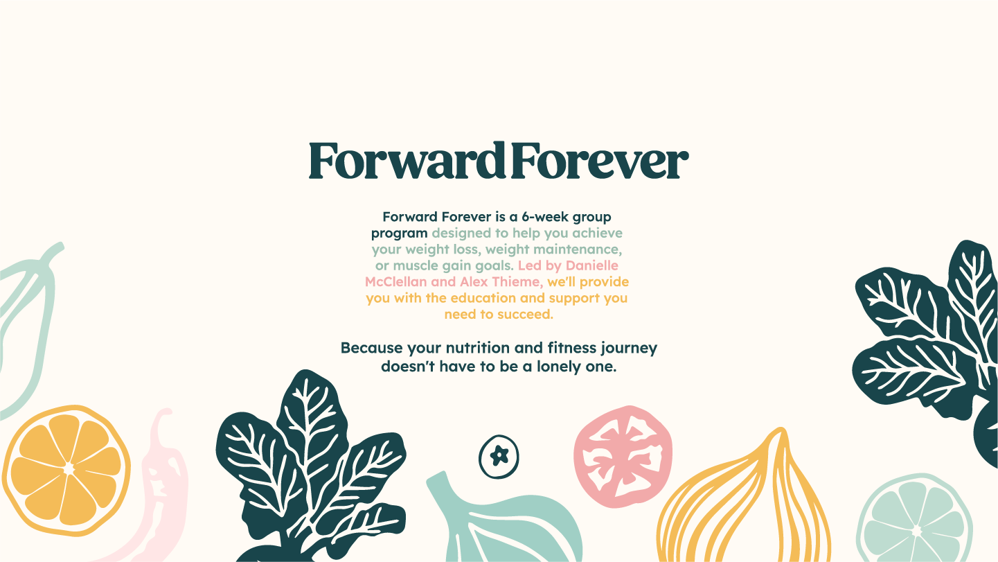
Forward Forever
Forward Forever wanted to reach more people and make a bigger impact in the health and fitness world. So, we teamed up to develop a fresh brand identity that matches their energy.
I started by building on their existing colours, making them more flexible and fitting their overall goals. Danielle loved vintage fonts, so I went with a modern twist on that style. To give the main logos some extra flair, I hand-drew the swashes to show movement and flow – it’s all about keeping things dynamic and reflecting Forward Forever’s vibe.
The illustrations are hand-drawn too, making them feel friendly and approachable. I wanted to avoid a stiff, corporate look, but still keep things professional and trustworthy. The whole design is intended to be welcoming and supportive, showing people that health and fitness are goals they can really reach.
The final design strikes a balance between friendly and professional. It creates a welcoming atmosphere where clients feel comfortable and supported, while also conveying the expertise and experience of the Forward Forever team.
Brand Identity
Modern & Approachable Professionalism
Keywords
Friendly, Approachable, Welcoming, Fresh, Empowering
Deliverables
Logo suite, illustrations, pattern, colours, Design Strategy & Behind the Brand, typography


Sarah was professional, organized, and timely in her work. She sent emails regarding the expected timeline for our logo and met all of the expectations.
She went above and beyond with the logo design and was able to capture the essence and goals of our nutrition program in such a short amount of time. The price was also very reasonable considering everything that she delivered. We will definitely reach out to Sarah in the future for any other design needs.
Danielle McClellan
Forward Forever