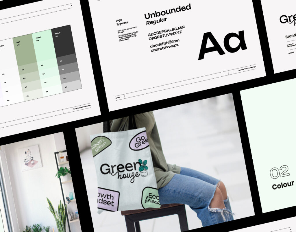
A brand style guide, sometimes called “brand guidelines”, is basically a rulebook for how to present your brand to the world. It’s the go-to reference for anyone creating content for your brand (including you!), making sure that all visual and verbal elements align with your brand’s identity.
Today I’m taking you BTS and showing you what a typical project includes, plus some examples, let’s get into it!
Table of Contents
Why is a Brand Style Guide Important?
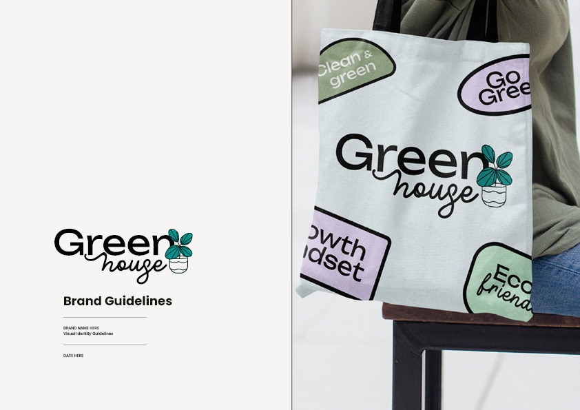
Think of your brand style guide as your brand’s DNA. It captures your brand’s colours, fonts, and overall vibe—though it doesn’t dictate how the market sees you. Instead, it shows how to properly use your logo, colours, imagery style, iconography, typography, and even the tone of your copywriting.
Some brand style guides are super detailed, offering examples of what to do and what to avoid, while others keep it short and sweet. It all depends on the business, and to a certain extent, the person who designed the guidelines in the first place.
What’s the Point of a Brand Style Guide?
Branding thrives on consistency. A style guide is your roadmap to achieving this, whether you’re working in-house or with external partners. It ensures everyone is on the same page about how to represent your brand.
A really good example of this is you may want to use two different designers for your branding & web design. The cool thing about having a style guide means you can hand this off to the web designer and feel confident that everything is still going to look consistent. Same thing if you work with a copywriter, social media agency, or if you ever want to collaborate with another business.
What Should a Brand Style Guide Include?
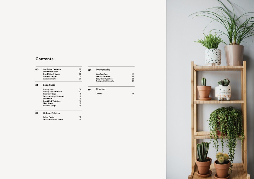
Like I mentioned earlier, it can vary a lot to be honest. I’ll give you a rundown of what you’ll usually see, plus some extra bits & bobs you might find.
Essential Sections
- Logos
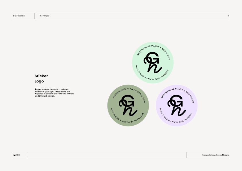
You’ll have more than one logo in your brand design (I typically include 3 or 4 variations). Your guidelines will cover each of them and give you a general idea of when and where to use each version. - Typography
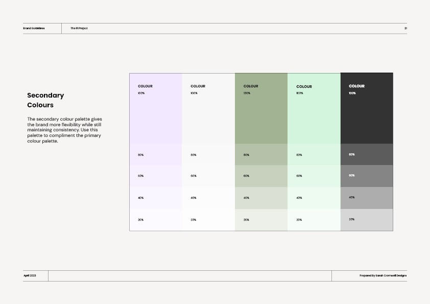
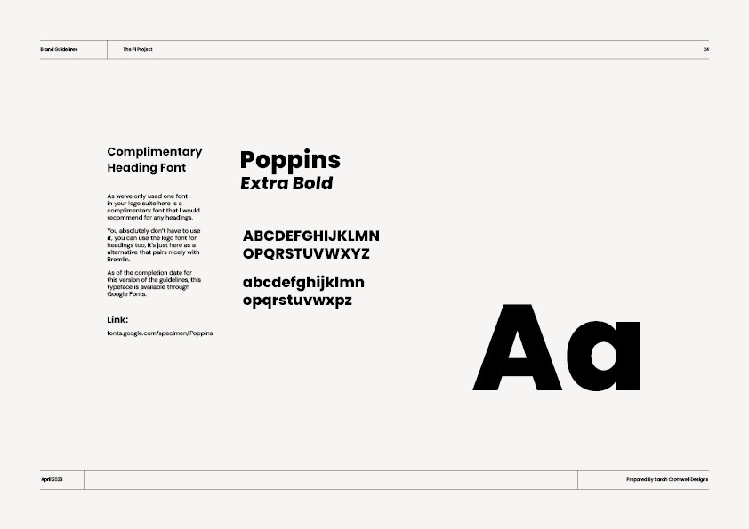
Details on font styles, sizes, and spacing to maintain consistency. - Colour Palette
Your primary and secondary colours, complete with HEX, RGB, CMYK, and sometimes Pantone codes. - Imagery
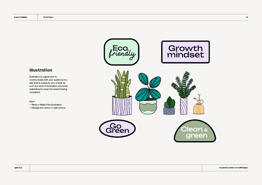
Guidelines for photos, illustrations, patterns, and artwork that align with your brand. - Usage Examples
Clear examples of acceptable and unacceptable uses of your brand elements. That includes logos, fonts, patterns, colours—the works.
Optional Sections
- Brand Strategy Sections
A breakdown of your brand strategy including a tone of voice guide, messaging, and so much more. - Core Values
This section outlines the fundamental beliefs and principles that drive your brand. It’s about what your brand stands for and what it strives to achieve, providing a moral and ethical framework that guides your brand’s behaviour and decision-making processes. - Mission Statement
Your mission statement succinctly defines the purpose of your brand. It explains why your brand exists, what it aims to achieve, and how it plans to serve its audience.
You may also want to include a separate media pack if you intend to work with the press or collaborators. But that’s another blog entirely!
So, to wrap it up.
A comprehensive brand style guide ensures your brand always looks its best, no matter who’s in charge. Just so you know, I provide a complete brand guidelines doc for every branding project, along with a mini style sheet for easy access to your core brand details.
So, if you’re interested in getting your own guidelines, give me a shout!

