Okay, so I’ve been seeing this Coastal Grandmother thing everywhere. You know, all that soft blue, white linen, and Nancy Meyers vibes. I’ve always loved playing around with brand ideas, so I thought, why not turn this trend into a brand? Let’s see what happens.
Table of Contents
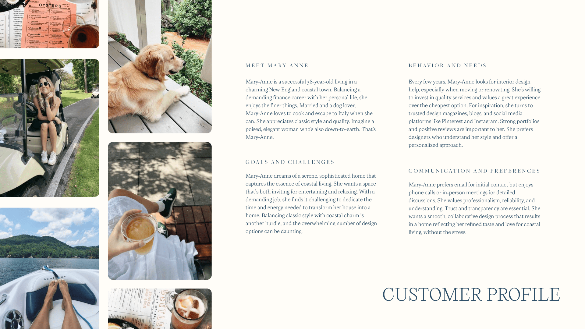
Why the Coastal Grandmother aesthetic?
There’s something undeniably appealing about the Coastal Grandmother vibe. It’s like wrapping yourself in a cashmere blanket on a chilly day – comforting, stylish, and utterly relaxing.
I wanted to capture that essence and create a brand that felt like a warm summer evening, sipping an ice cold margarita, you get me?
The Spark
The idea started with a casual TikTok scroll, as these things often do. But it was more than just a passing trend. I genuinely love the aesthetic and saw a huge potential for a brand that could truly embody the Coastal Grandmother spirit. The classic color palette, the sense of calm it evokes – it all felt perfect for a strong brand identity.
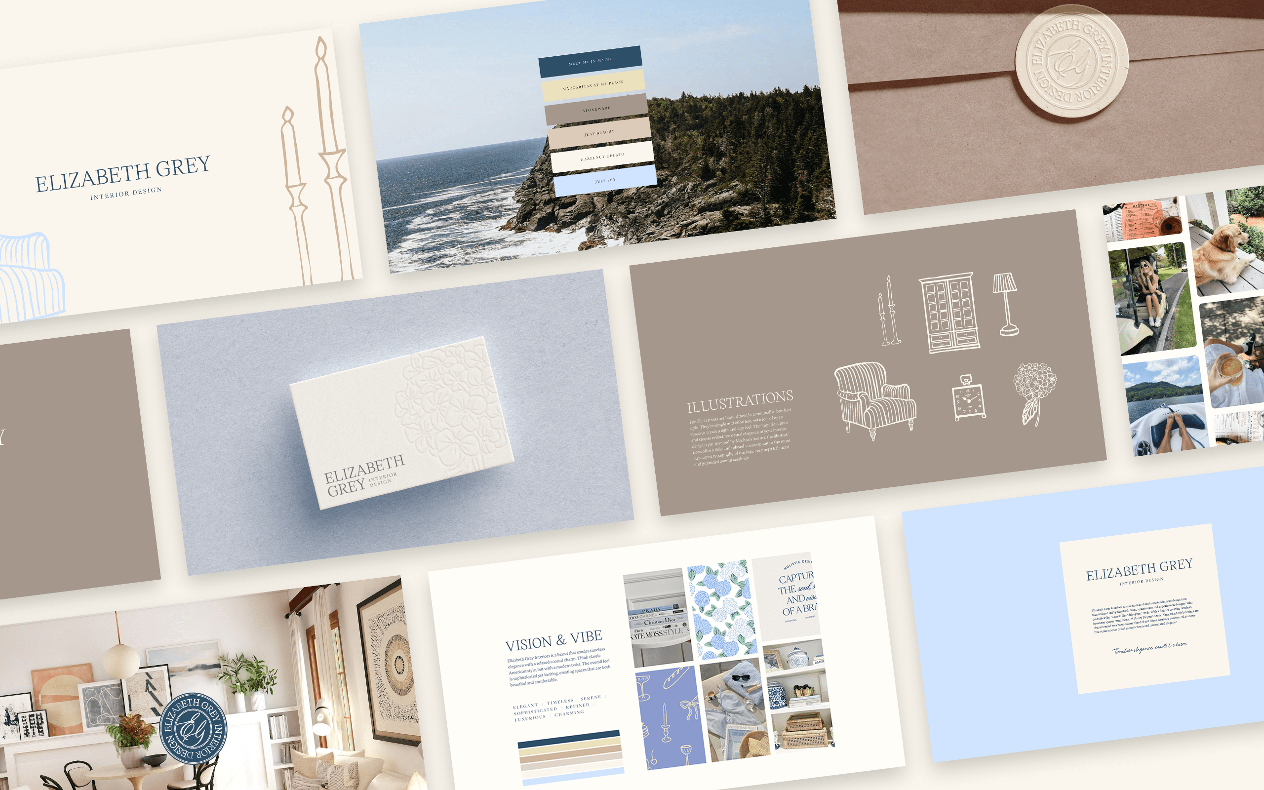
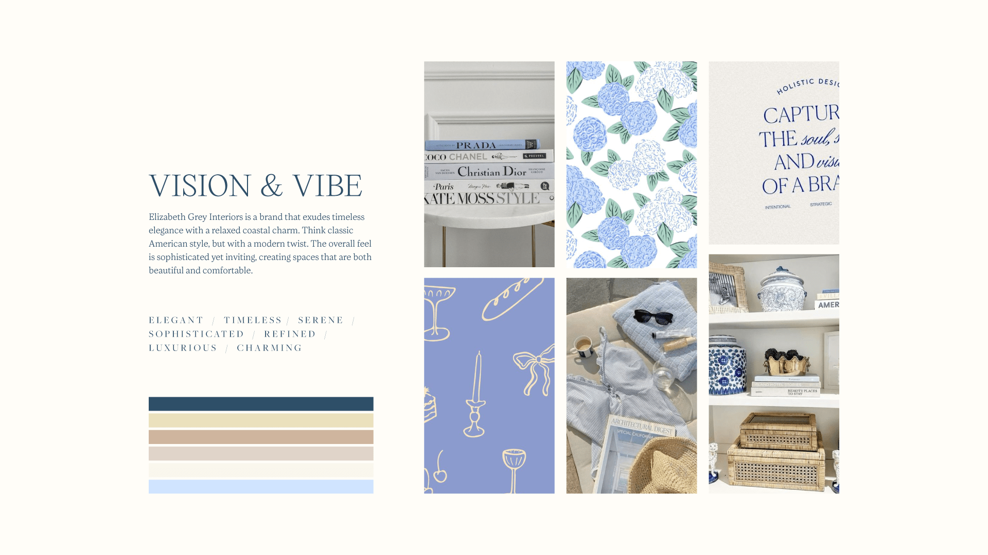
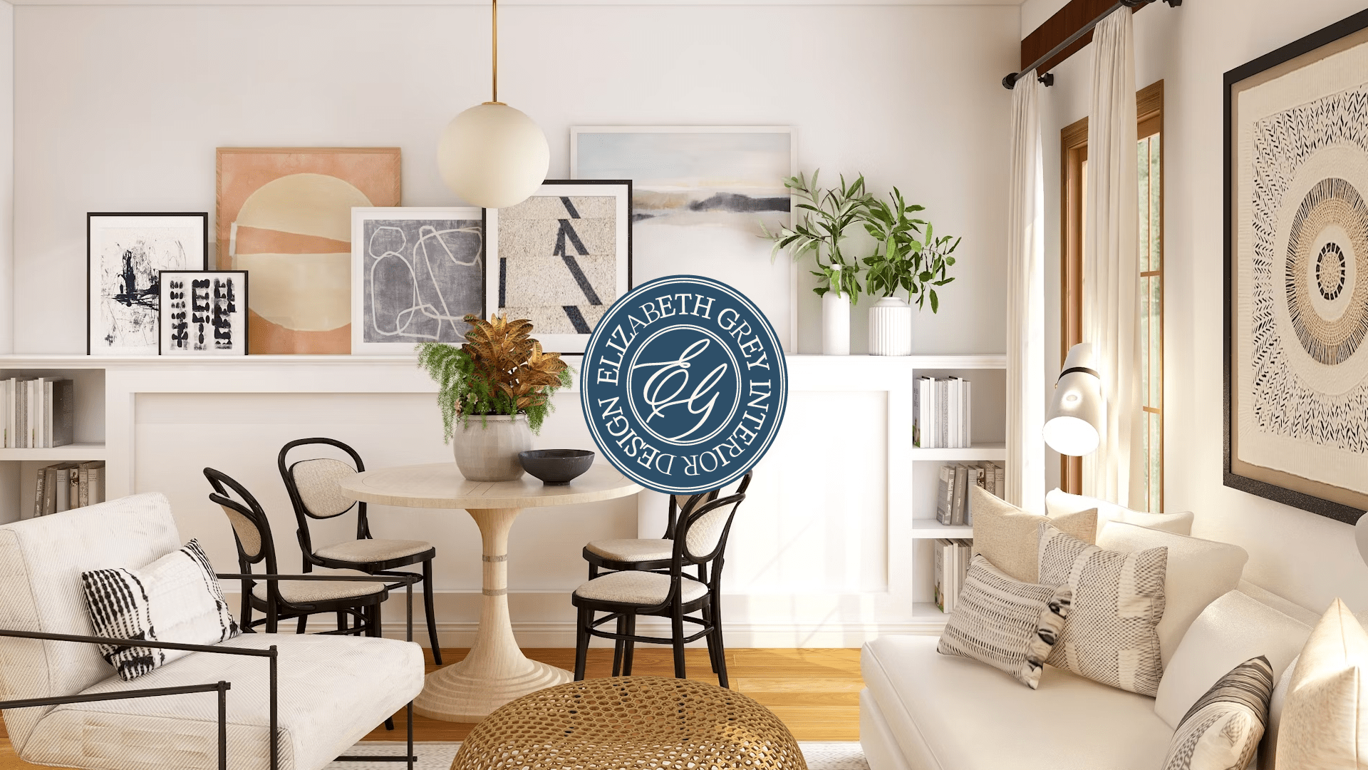
The Vibe
Think of a sun-kissed beach house, but with a touch of luxury. That’s the vibe I was going for. It’s about creating spaces that are effortlessly stylish and make you feel instantly at home. Cosy, calm, and collected – that’s the Coastal Grandmother way.
The Deliverables
I wanted to create a brand that was as dreamy as the trend itself. So, I put together a brand identity that included:
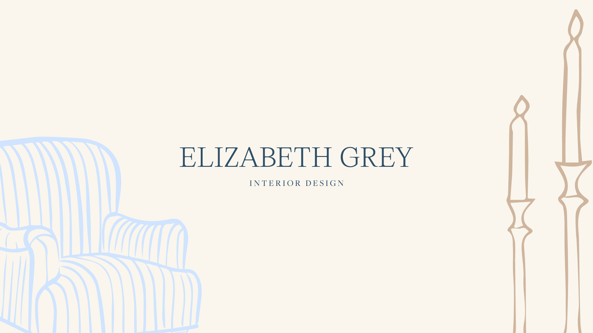
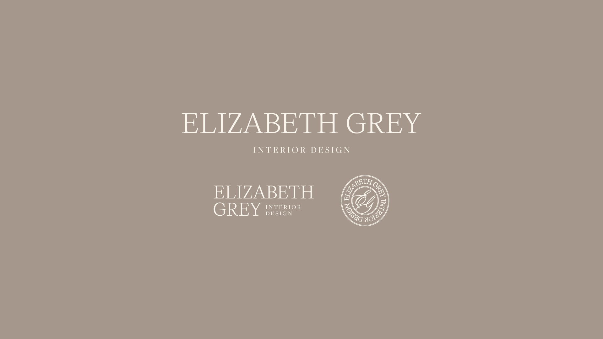
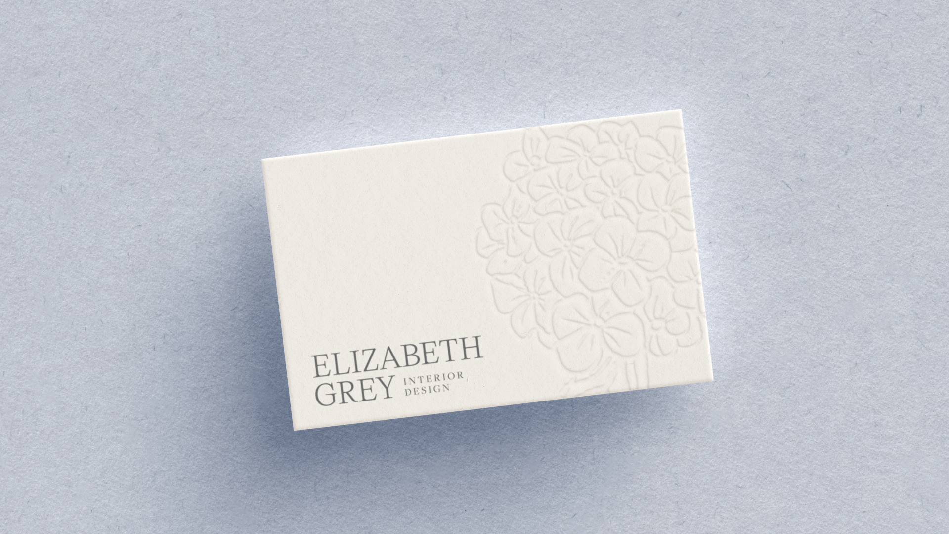
A logo that felt classic and timeless
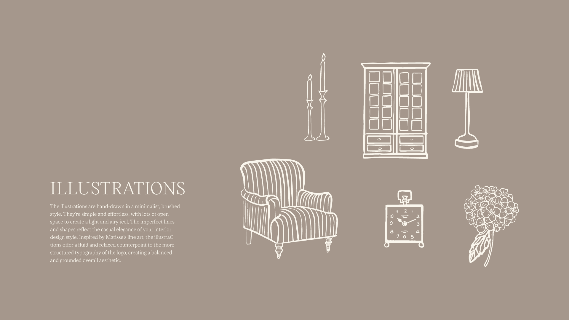
Perfectly imperfect illustrations to reflect the relaxed vibe of the brand
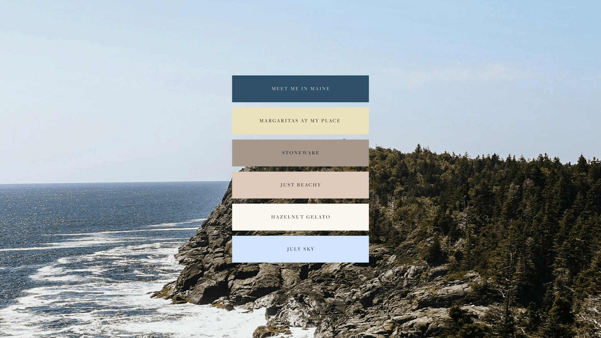
A colour palette of soft blues, whites, and neutrals
A pattern that added a touch of coastal charm
The Reflection
It’s been a fun change of pace working on this project. I usually gravitate towards a more structured, almost iconic style in my illustrations, so it was a nice challenge to loosen up and go for a more hand-drawn, vintage feel. I’m really happy with how it turned out.
I’m still buzzing about the contrast between the classic, structured typography and the loose, hand-drawn illustrations. It’s a combination I wouldn’t normally go for, but it’s created a really interesting dynamic. I can’t wait to pair up with a business that would be interested in trying this out for themselves in the future.
Are you vibing with this?
This was just a fun experiment, but I’d love to turn this into a reality. If you’re an effortlessly chic business owner looking to create a brand that’s as timeless and elegant as your gorgeous self, let’s chat.