
What’ve we got ’ere then? Caught ya lookin’
Picking projects for a portfolio is like picking your favourite child. Impossible. But we move. I’ve hand picked five pieces from recent and not so recent work and I want to tell you why these ones specifically.
So why have I chosen these?
- Range. I work across industries and I wanted you to see that. No two projects are the same, because no two businesses are the same.
- Relationships. Two of these clients came back for more. I like that. It tells you something about how I work and what it feels like to be on the other side of it.
- Real problems. Every project here had a specific challenge that went beyond “make it pretty.” I wanted you to see how I think, not just what I make.
Case study
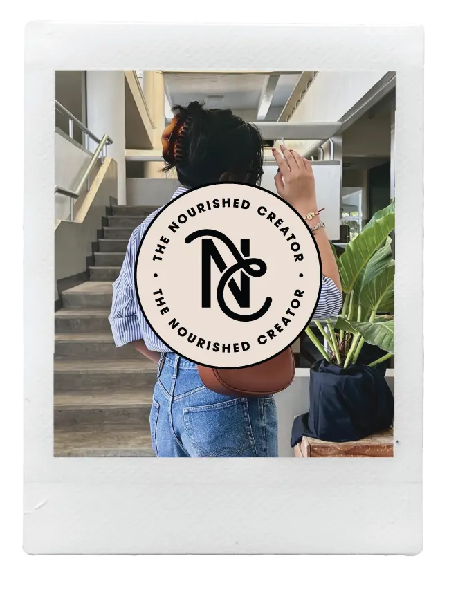
The Nourished Creator
The Nourished Creator is a group programme bringing together three areas of expertise under one brand: strategy, creativity and support. A team offering, built to feel like a cohesive whole.
See full project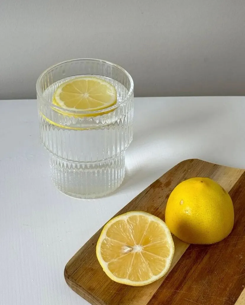
Case study
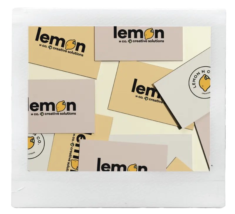
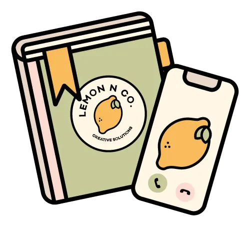
Lemon N Co
Lemon N Co is a UK-based creative agency, and Myda herself is a fellow Mancunian which made the whole thing feel even more like home. There’s something special about working with someone from your own city.
See full project
Case study
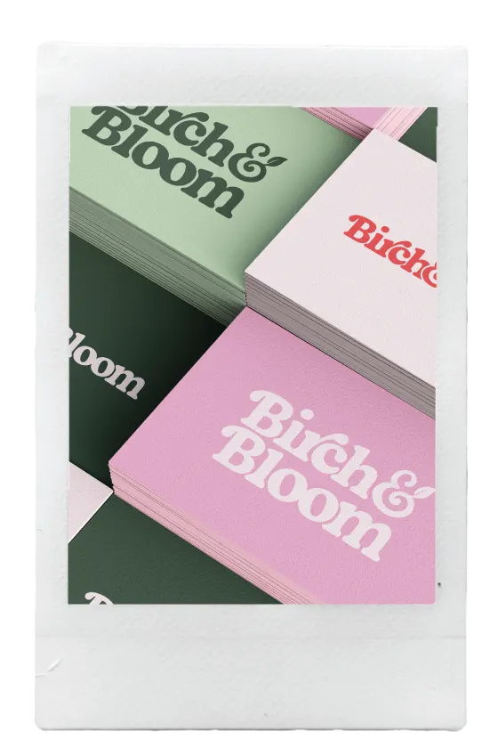
Birch & Bloom Social
Birch & Bloom Social is Chloe’s studio for small business owners who want social media to feel simple, strategic and a little more fun.
See full project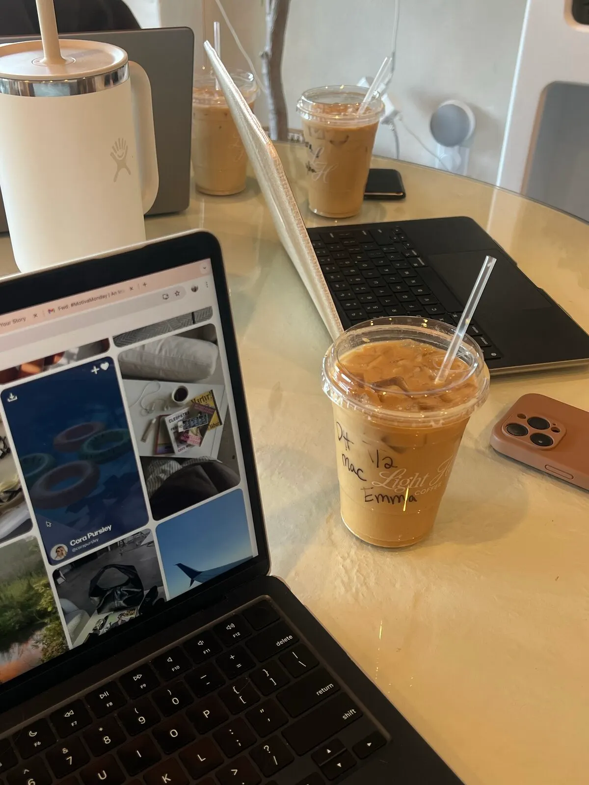
Case study
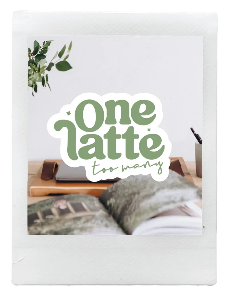
One Latte Too Many
One Latte Too Many is Natascha’s corner of the internet for female entrepreneurs who want to work smarter without burning out.
See full project
Case study
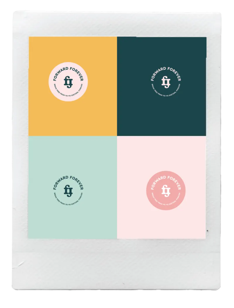
Forward Forever
Forward Forever were ready to reach more people and make a bigger impact in the health and fitness space. We worked together to build a brand identity that actually matched their energy.
See full project