
Today, I’m taking you behind the scenes of another passion project: crafting the brand identity for “Green Goddess,” an eco-conscious cleaning company!
Table of Contents
Why a cleaning company?
Frankly, most cleaning service brands look…well, a little harsh. All those sharp lines and aggressive chemical vibes? Not exactly what comes to mind when I think of sparkling clean.
Green Goddess is different. They’re all about sustainable, planet-friendly cleaning solutions that are safe for pets and little ones. They wanted a brand that reflected their gentle touch and dedication to a healthy environment.
This project was a chance to showcase the power of branding to create a warm, inviting image – even in an industry often associated with harsh chemicals. So, grab your favorite non-toxic cleaning spray (just kidding… kind of) and join me as I bring Green Goddess’s brand vision to life!
The Spark
Traditional cleaning companies often rely on harsh chemicals, which can be harmful to the environment, pets, and children.
I saw an opportunity to create a brand that spoke to a growing desire for sustainable and gentle cleaning solutions. Green Goddess offers a sparkling clean with a focus on planet-friendly products, pet and child safety, and a positive, chemical-free approach.
The Vibe
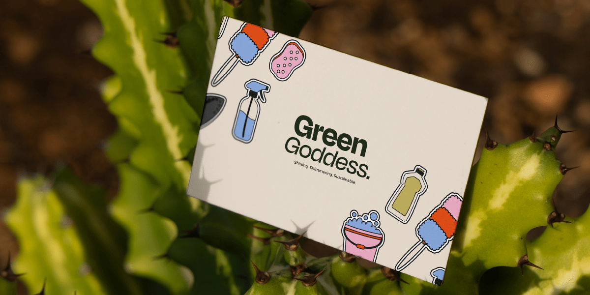
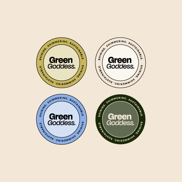
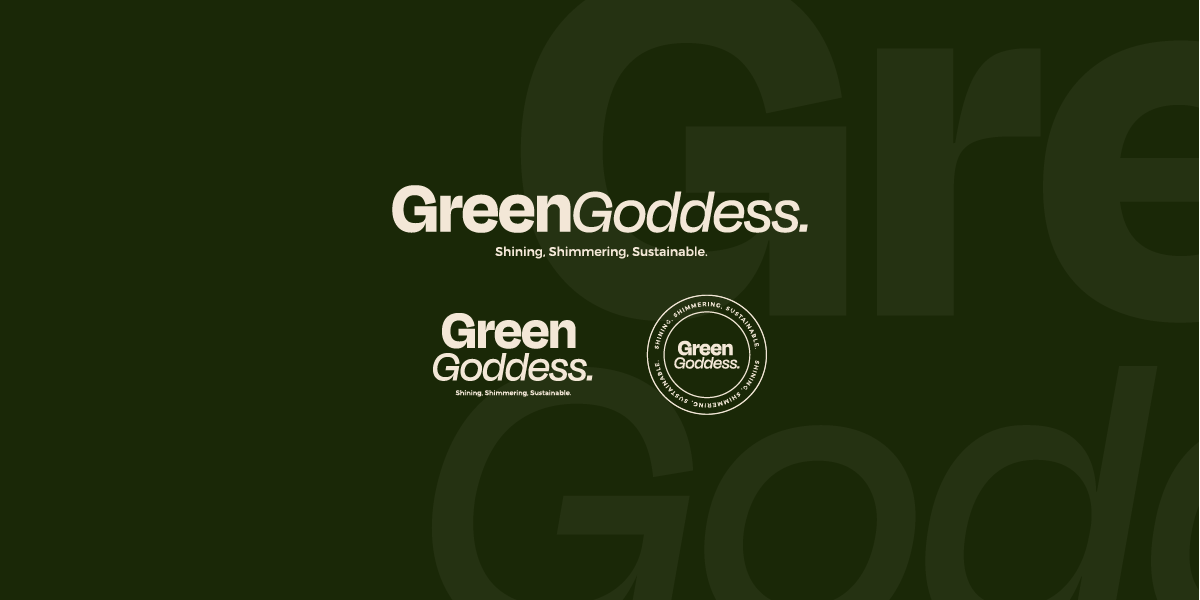
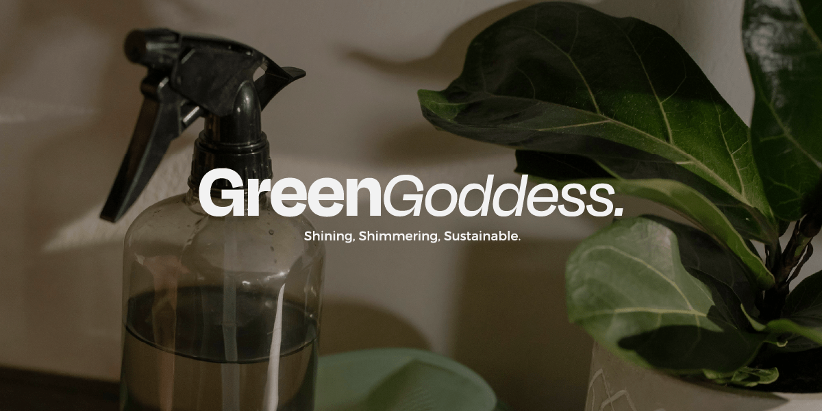
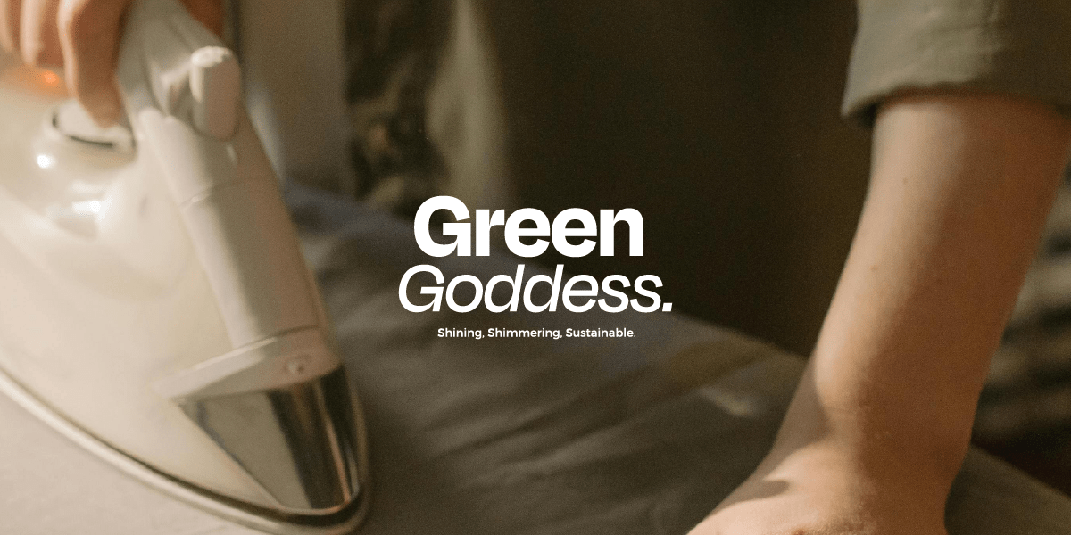
For Green Goddess, I wanted a brand that felt clean, fresh, and approachable. Think calming greens, a symbol of nature and sustainability, paired with a light and airy blue accent. This colour combination evokes a sense of trust and tranquillity, reflecting the brand’s commitment to gentle cleaning.
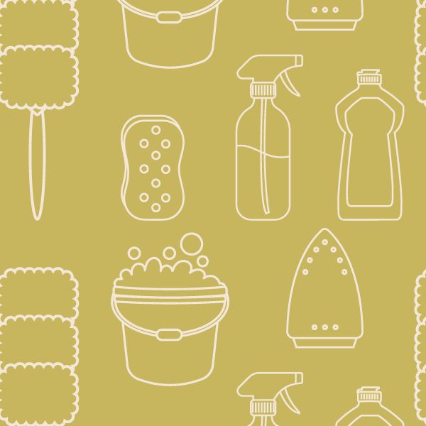
I wanted to avoid being too literal. Green cleaning doesn’t have to be sterile! I incorporated a set of fun and colourful illustrations that added a touch of whimsy and personality.
The Deliverables
This brand refresh wasn’t just about a logo. I created a complete brand toolkit to help Green Goddess make a lasting impression on eco-conscious clients. Here’s what they got:
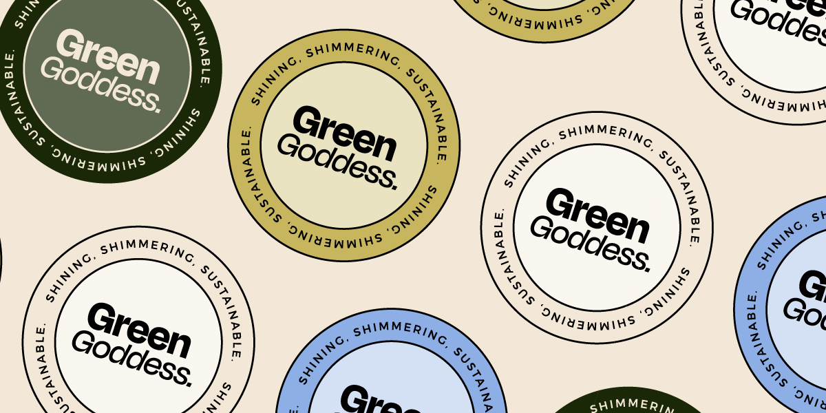
- Minimalist Logo Suite: A clean and modern logo design that conveys professionalism.
- Whimsical Cleaning Illustrations: A set of playful illustrations to add personality and visual interest.
- Sustainable Colour Palette: Greens and light blues representing eco-friendly practices.
- Flexible Brand Guidelines: A guide on how to use the brand elements consistently across various platforms.

The Reflection
Working on Green Goddess’s brand identity was a breath of fresh air (pun intended!) – like that feeling after you fling open the windows and let the sunshine chase away all the cleaning product fumes! Creating a visual language that celebrates clean living and environmental responsibility, all without falling into the usual cleaning company clichés.
This project solidified my belief that branding is all about ditching the boring and expected. Green Goddess is about innovation and making cleaning a positive experience, and their brand screams that from the rooftops. I played with the colour scheme, using calming greens for a chill vibe, but then threw in a light blue curveball to keep things interesting. It’s a subtle way to show that Green Goddess isn’t afraid to break the mould, just like they do with their eco-friendly cleaning magic.
Are you vibing with this?
While I adore exploring branding possibilities through passion projects, my true passion lies in collaborating with real-life small business owners. If you’re a business owner seeking a brand that reflects your unique story with zest and vibrancy, then I’d love to chat.
